The Process
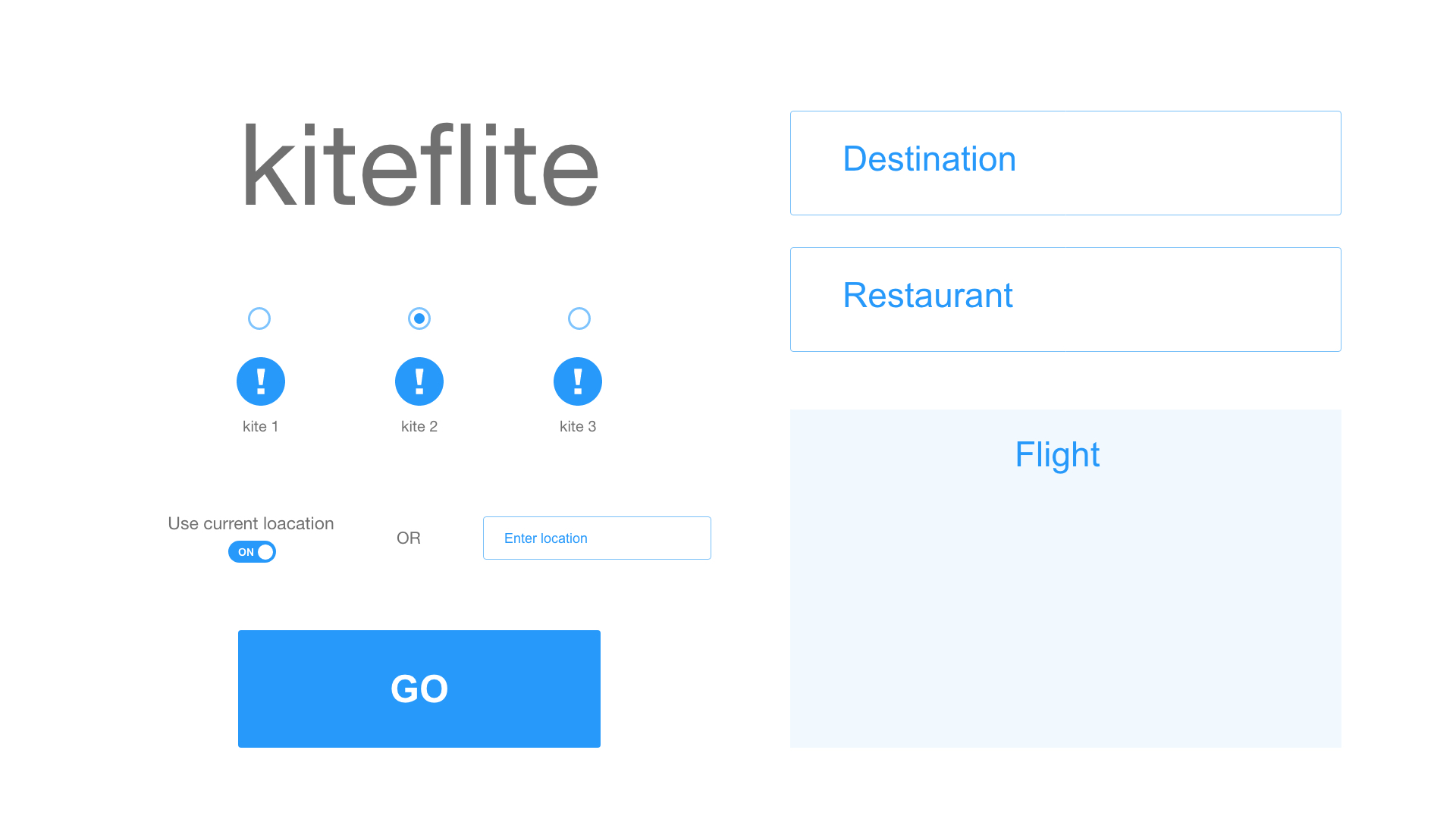
We started by writing a high-level design proposal of our product where we discussed our goal of desired functionality, stretch goals, and fallback goals. We developed a sprint backlog that we would refer to when delegating and accomplishing tasks throughout each Scrum sprint. Lastly, I created an initial interface wireframe that we used to visualize our end product.
 Initial interface
User Studies
With our basic interface implemented, we conducted a series of user studies to understand how our target users interact with our product and make improvements based on what we observe.
The first was an online survey in which users interacted with our interface and rate statements based on how much they agreed with them on a 1-5 scale. They also had an option to input qualitative feedback on changes they would like to see.
The second was a series of contextual interviews that we conducted with 5 users. We started by asking questions about the user’s background, pain points, frustrations, goals, and needs associated with our product. Then, we observed the users as they interacted with our interface.
From our user studies, we concluded that we needed to address accessibility of our product for users that are visually impaired or colorblind. We also found that we needed to streamline the user’s journey by making it obvious what information was needed and what had to be clicked in order for a result to appear.
Development
Once we determined our functionality and usability goals through user research, we were able to start the development process. Following the Agile Scrum methodology, we split our development timeline into three Sprints in which we would have a product launch and Sprint retrospective at the end of each.
We used OpenWeatherMap API to gather current weather data from cities around the United States, and we determined the most ideal city to fly a user-inputted kite type based on optimal weather conditions. Next, we utilized Skyscanner API to find same-day flight itinerary from the user’s current location to the calculated destination. Lastly, the Yelp API was used to find a highly rated park and café in that destination.
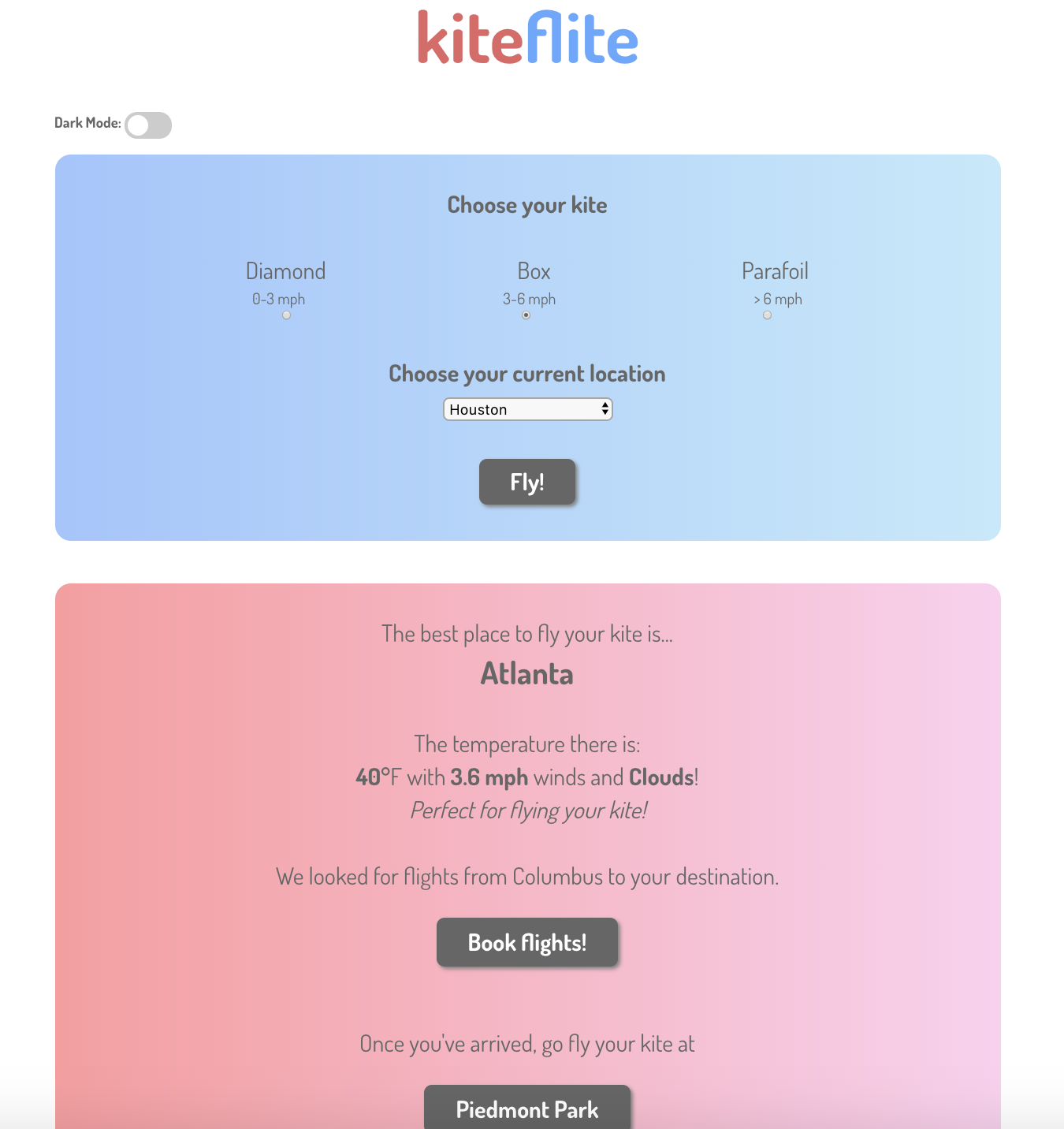
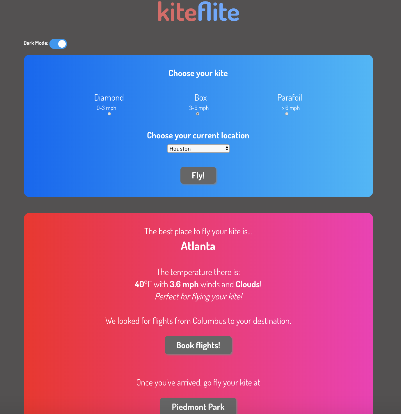
When the back-end was complete, we refined our front-end interface based off the conclusions of our user research. We implemented more instructions on what information is required from the users as well as an option for dark mode for higher accessibility.
 Light mode
 Dark mode
All of the code is available on GitHub!