The Challenge
" Your school wants to strengthen the community by encouraging experienced students to connect with new students and help them adjust to campus life. Design an experience that allows mentors and mentees to discover each other. Consider the needs of both mentors and mentees, including how someone may become a mentor and how to connect mentors to mentees. "
Timeline: 1 week (2/20/2020 - 2/27/2020)
Research
I started out by brainstorming what I wanted the experience of finding a mentor or mentee to be. I did research on competitor products and took note of aspects that I liked and didn’t like about their design. Seeking a broad overview of my design, I jotted down what information, content, and features my app would need.
Before attempting to solve any problem, we should take a closer look into the issue at hand.
Finding the Problem
We want to strengthen the community of students at my school by providing an experience for people to create mentor / mentee relationships. The current underlying problem is that students are not seeking each other out to make these connections.
Why are people not seeking to create these relationships? Through interviewing a selection of current Texas A&M students, I discovered that students are overwhelmed by the opportunities to meet people thus never do or students feel like their need for mentorship is unreciprocated.
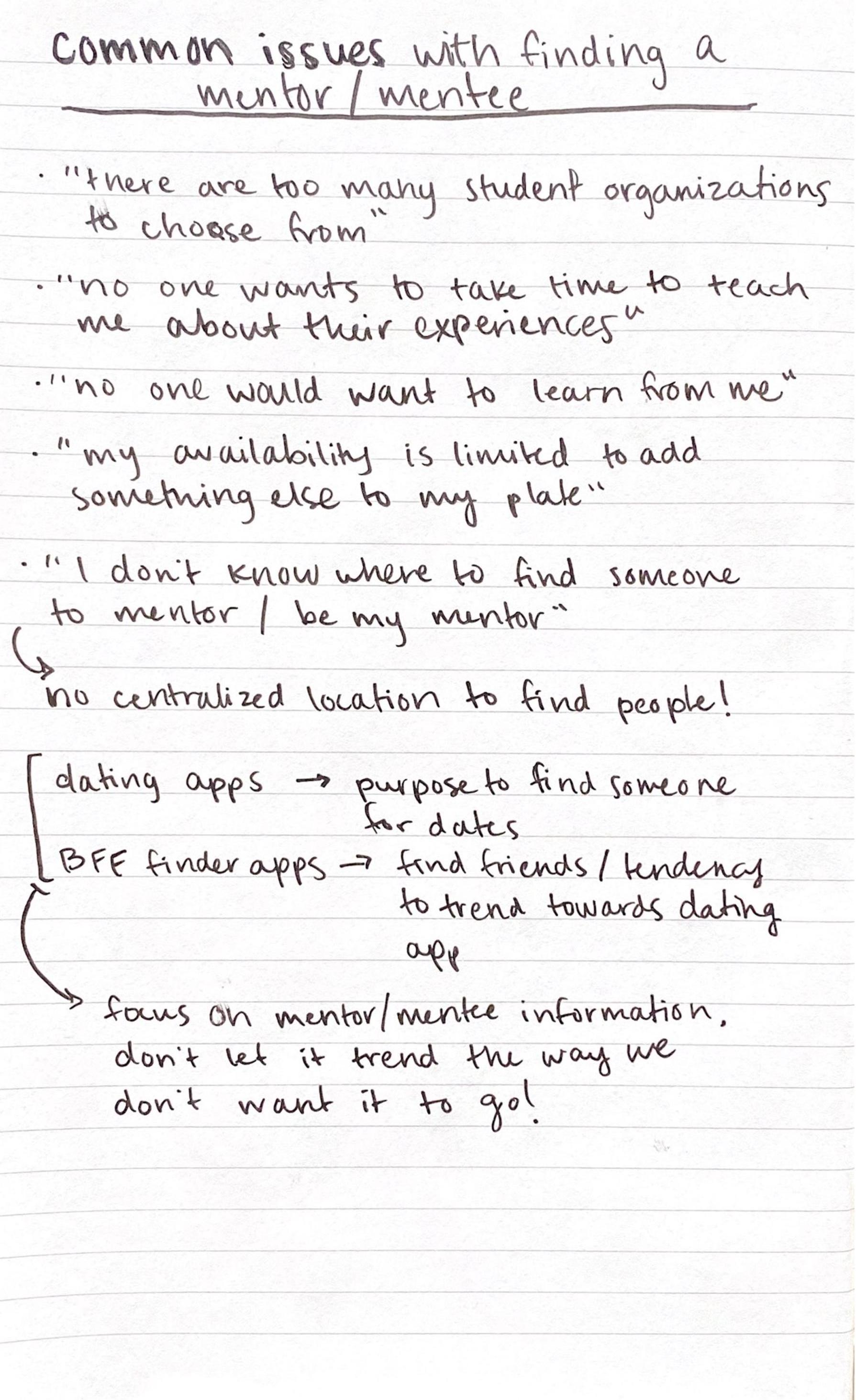 Subject issues
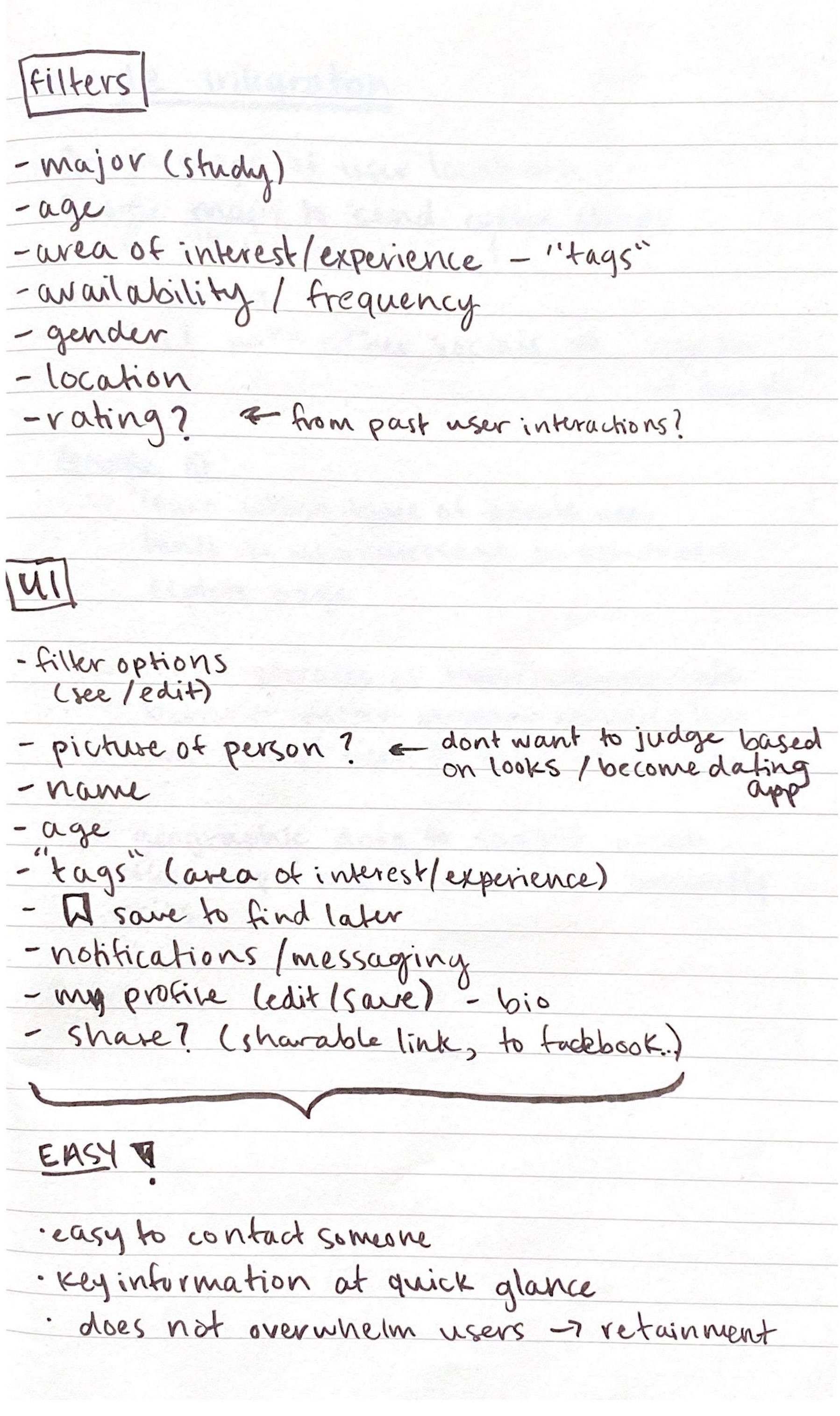 UI / Filters
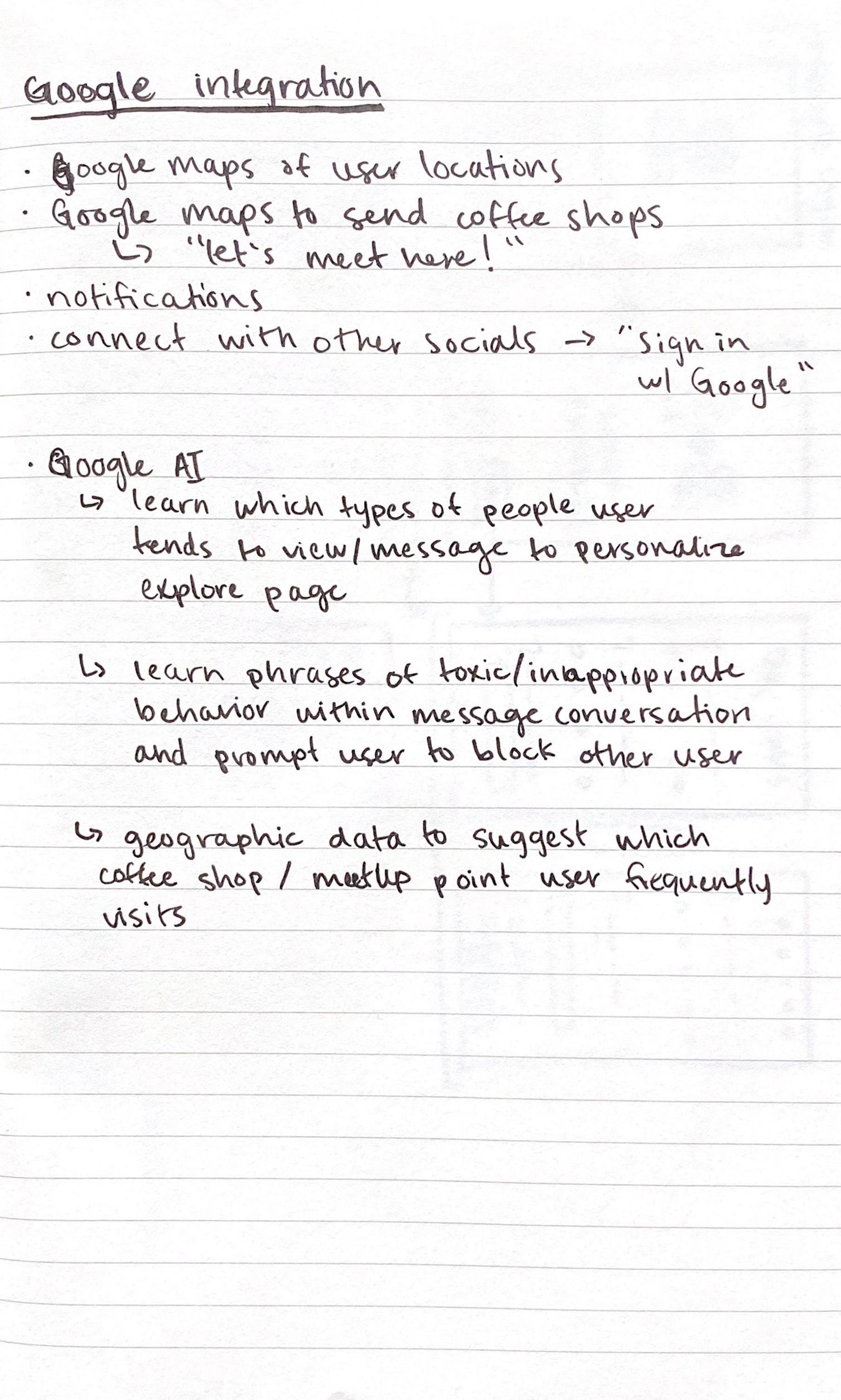 Google integration
Solving the Problem
With these discoveries in mind, I decided to come up with a central mission statement for the app.
Get mentors to find mentees, and get mentees to find mentors.
In order to achieve this mission statement, I created three goals that I would focus on:
- Allow users to start finding matches instantly
- Provide information for users to find the best match possible
- Make the journey from sign up to match simple and clear
Now that we know what the problem is and what the approach to solving it is, we can start the design process.
The Process
Sketches and Wireframes
The research was thorough enough to know what main information, content, and features my app would require, so I started with a quick sketch to map out the user flow.
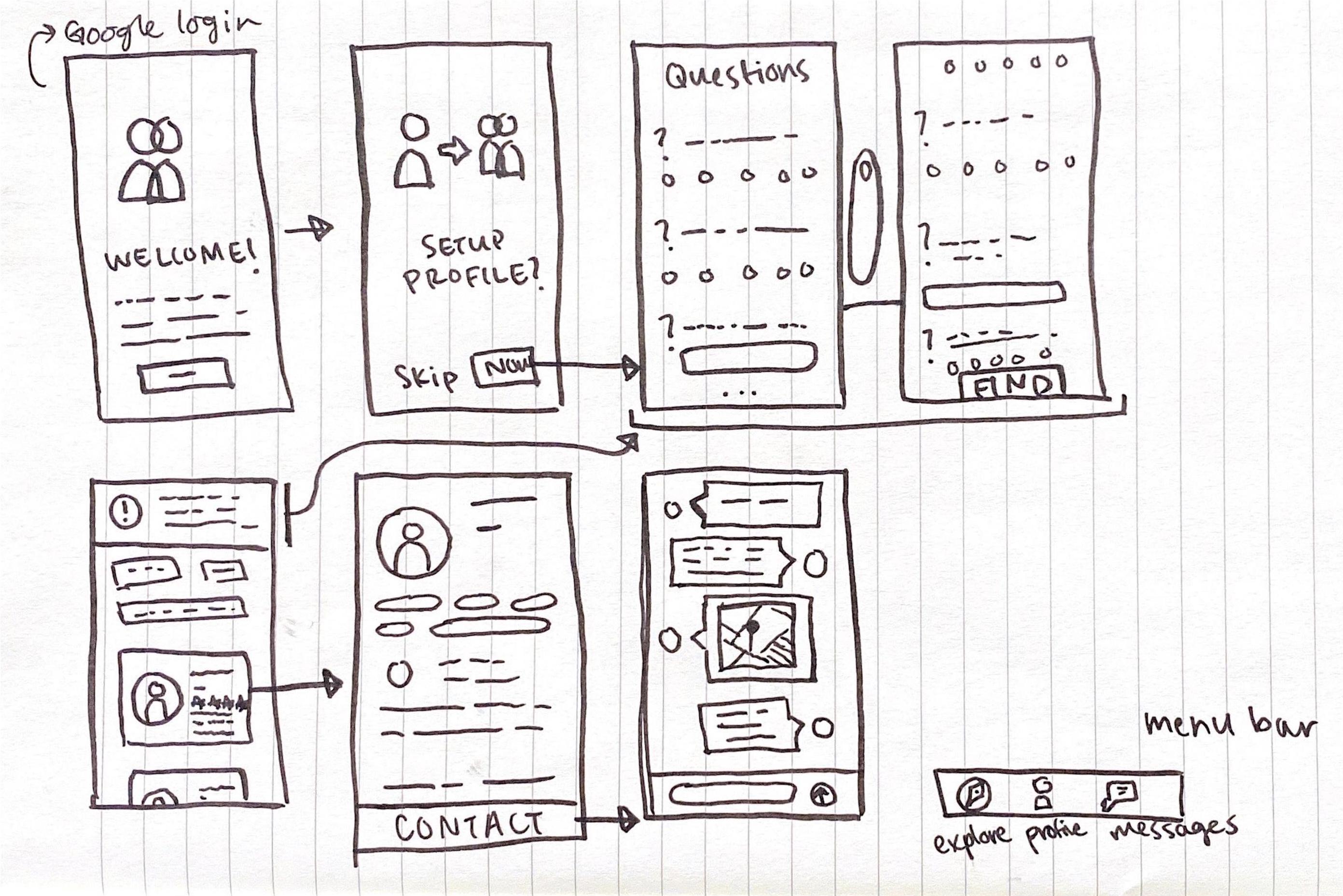 User flow
After a few more iterations of the user flow on paper, I took the design to Adobe XD where I had more flexibility to develop a low fidelity wireframe.
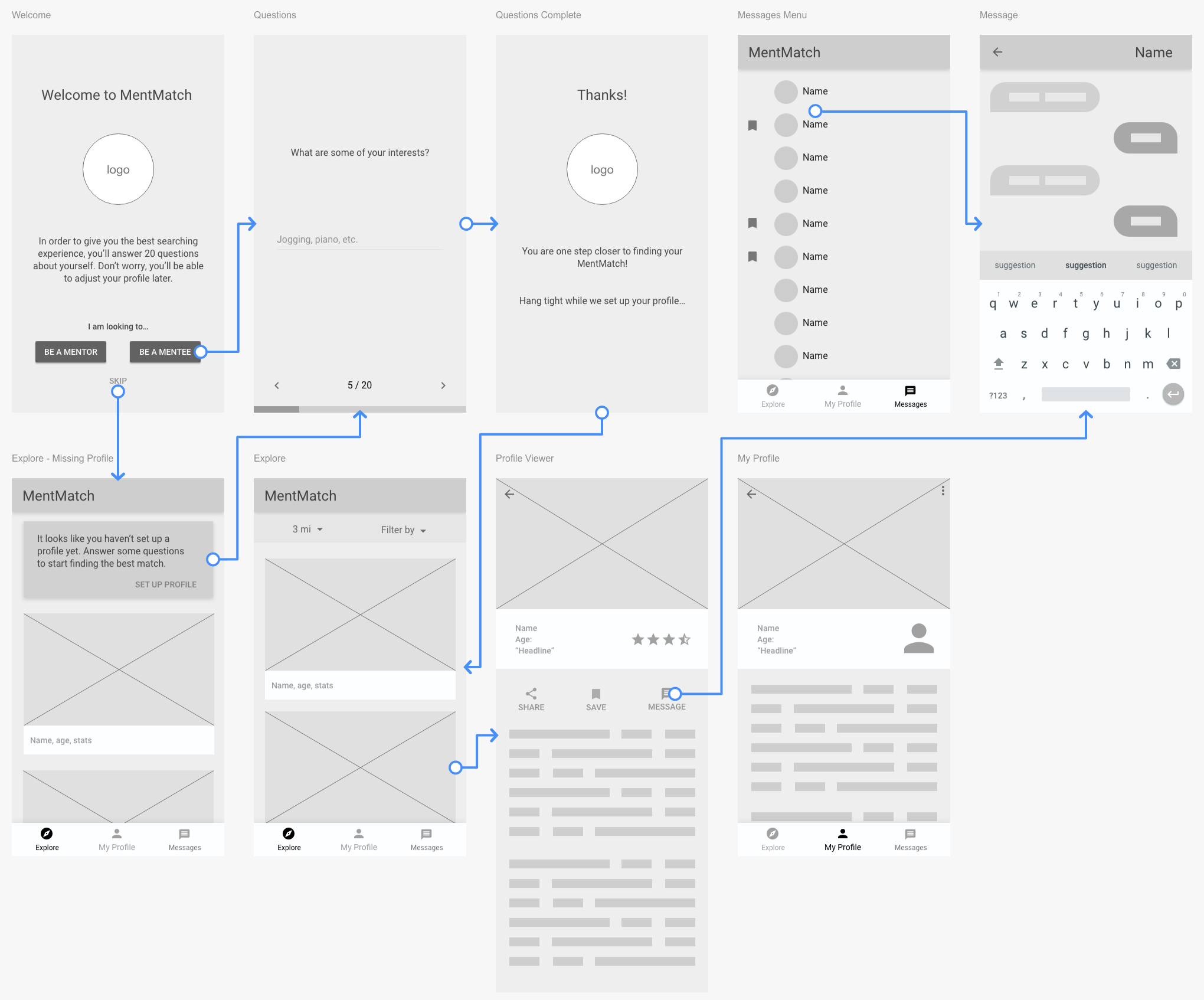 Low fidelity wireframe
The overall user journey can be split up in three main stages. The user’s profile including the initial profile creation, exploring other profiles, and contacting a suitable match. The tabs located in the bottom navigation bar makes transitioning between stages fluid. This clear and simple navigation contributes to achieving goal #3.
Since messaging and saving profiles works similarly to other applications, I won’t go into detail about how they function.
Let’s discuss the most important sections in the user flow.
Profile Creation
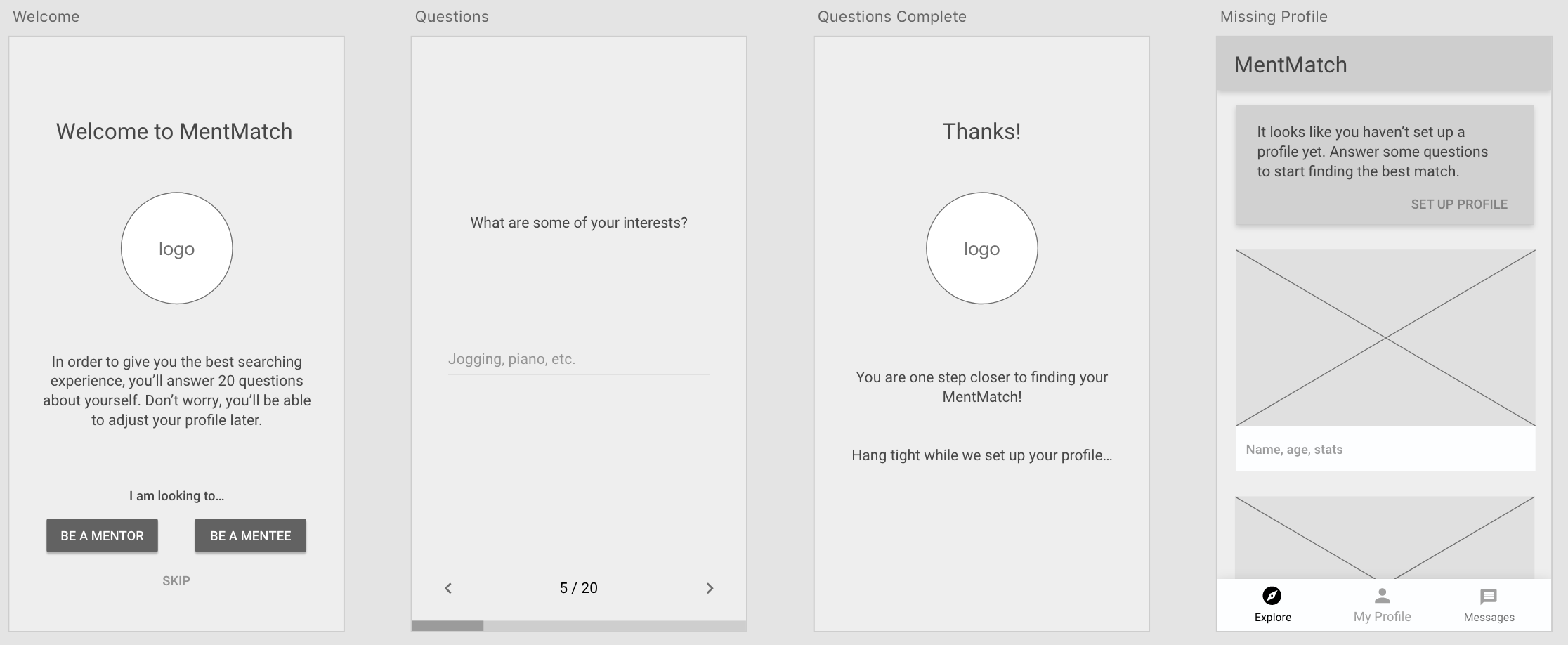 Profile creation
The welcome screen is fairly simple. The user will get an introduction to the app and immediately be prompted to start setting up a profile based on their user identity.
The questionnaire is also simple. Once the user is identified, they will begin to answer a series of questions in order to completely fill in their profile based on their answers. This clear and simple navigation contributes to achieving goal #3.
When the user finishes their questionnaire, they are instantly ready to start the search for a match. If they desire, users will have the option to change or add information that was automatically filled on their profile page.
With goal #3 in mind, the questionnaire splits up the overwhelming stare of a blank profile into small approachable questions that users feel comfortable answering one at a time.
If the user decides to skip the questionnaire, they are taken to the explore page where they can only view profiles. A notification card urges the user to complete the questionnaire, and it remains there until a profile is created.
Explore Page
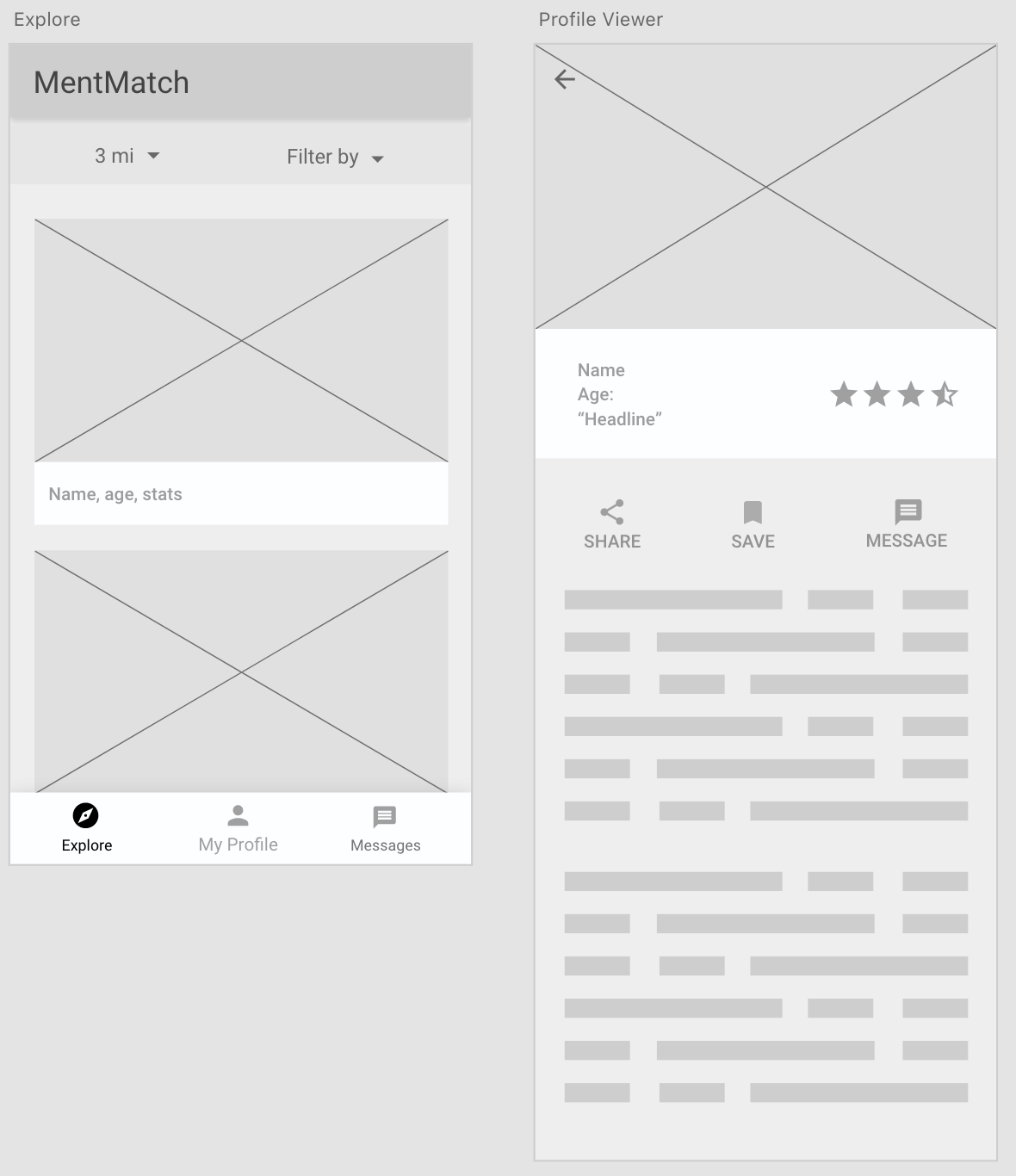 Explore page / profile view
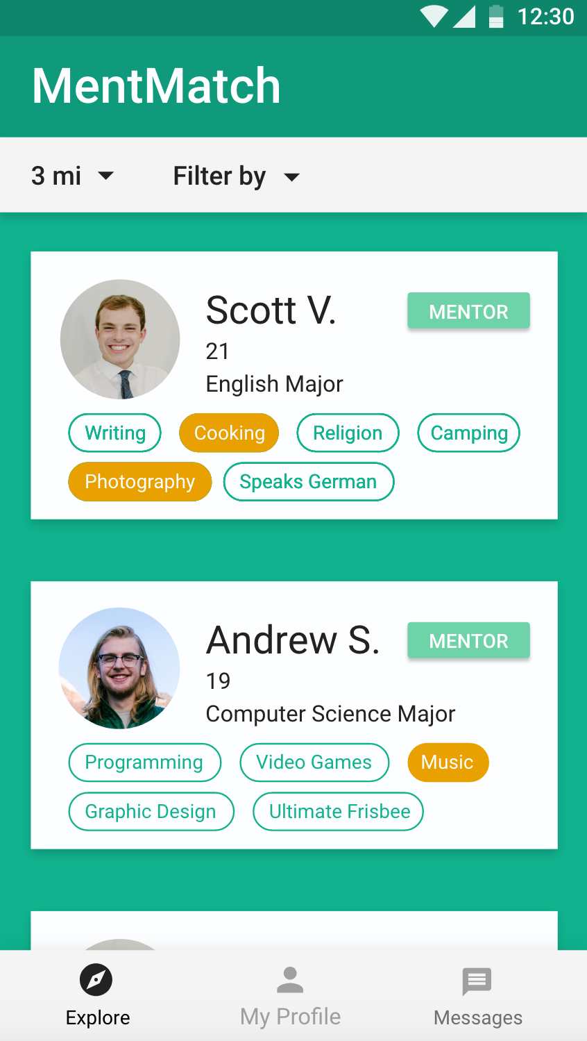
Like profile creation, the explore page is simple. We do not want any unnecessary distractions for a user trying to reach their end goal of finding a mentor / mentee.
Based on the user’s identity chosen on the welcome screen, the explore page will show profiles of the compatible identity. If you are looking to become a mentor, you will see potential mentees.
If you are looking to become a mentee, you will see potential mentors. In order to achieve goal #2, each profile on the explore page is comprised of compact cards with key information such as name, age, and interests.
Profiles with the closest match to the user’s answered questions will appear at the top, highlighting the aspects that makes them a good match. Profiles with little compatibility to the user will not be hidden. Instead, they will just appear lower down on the list. Additionally, users have the option to filter results based on desired criteria like age, major, or interests.
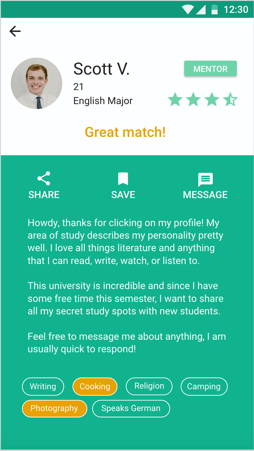
In an effort to achieve goals #2 and #3, the full screen profile viewer provides the user with only necessary information to aid them in moving forward in the flow.
With a full view of profile information, compatible criteria is highlighted, informing the user why this profile is a good match. Competing products would bombard the user with irrelevant information, making it more difficult to make a decision.
Action buttons (share profile, save profile, and message user) are provided at the top of the profile to streamline user flow and help them reach their end goal.
High Fidelity
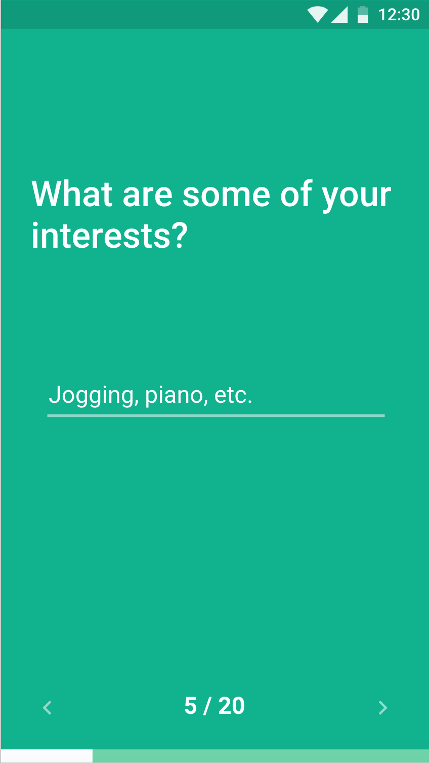 Questionnaire
The profile setup contains a lot of questions, so in order to expedite the process and accomplish goal #1, the user should be able to understand what is asked quickly. No clutter to get in the way.
The indicator at the bottom lets the user know how much of the questionnaire is left. If they need to change an answer, the arrows let them navigate seamlessly between questions.
. . .
Since we aren’t designing a dating app, we want the profile picture to take a back seat send relevant information to the front.
Uniform and clean compact cards display key information allowing users to browse for a match without feeling overwhelmed.
The cards are clearly marked with overlapping interests between users, so they instantly know who is most compatible with them.
 Explore page
. . .
 Profile view
Not everyone is as compatible in person as they are on paper. We didn’t want users to be defined by their rating from previous interactions, so we saved it for the full profile view.
This eliminates users from scrolling too quickly on the explore page, only looking for highly rated matches.
Stretch Goals
If I were designing this product as a Google employee, I would extend our goals by taking advantage of the massive Google platform.
This app would benefit from numerous Google services and tools, but in particular, Google AI could be incorporated many ways to extend functionality and features of the design.
The Google Machine Learning Kit and natural language processing (NLP) could be implemented inside messaging within the app. The NLP APIs could detect the use of toxic or inappropriate phrases that lead to low in-app ratings. Then, Google AI would be able to predict that behavior in conversation and prompt the user to block communication with the other user.
 Subject issues
 UI / Filters
 Google integration
 User flow
 Low fidelity wireframe
 Profile creation
 Explore page / profile view
 Questionnaire
 Explore page
 Profile view